Story section
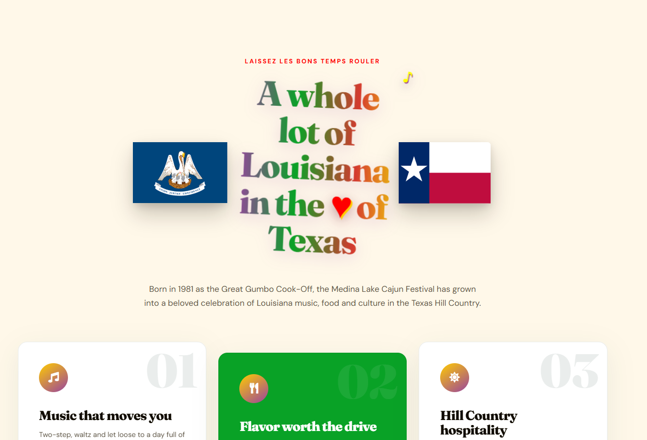
Louisiana in the heart of Texas
Oversized, animated editorial type, state-pride imagery, and bright section cards make the event's personality clear before visitors read every detail.
Festival website refresh
A 45th-anniversary festival site with poster energy, Cajun color, big memorable type, and practical paths for visitors who need the music, food, admission, and plan-your-day details fast.
Cajun Styling
A Festival site is not just an informational page. It should feel like a printed event poster, a food trail, and a visitor guide stitched into one bright, useful experience. No matter what your needs, don't settle for mediocre.
Oversized, animated editorial type, state-pride imagery, and bright section cards make the event's personality clear before visitors read every detail.
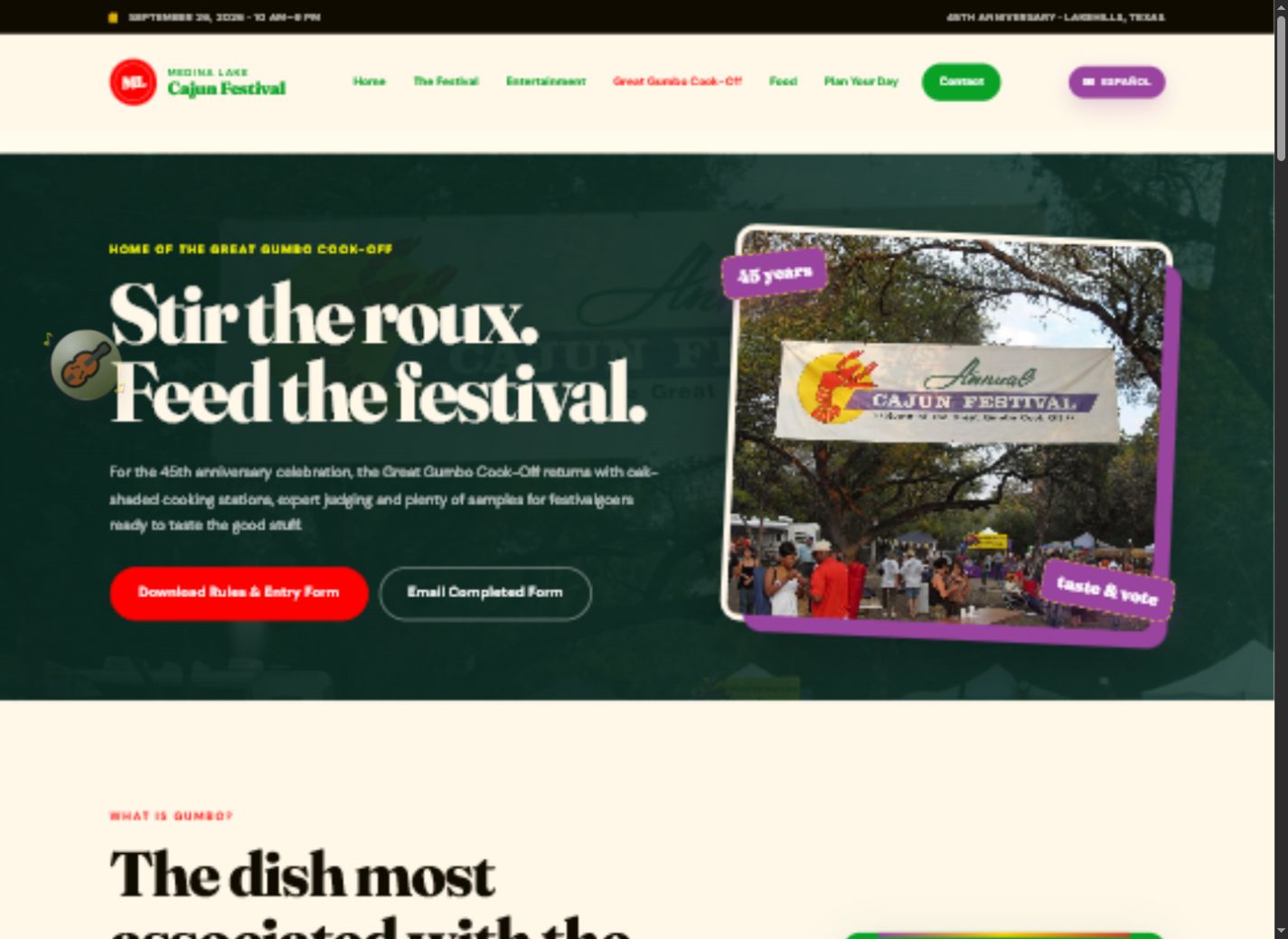
The cook-off page uses bold copy, angled media, and clear action buttons so a major attraction feels like a destination of its own.
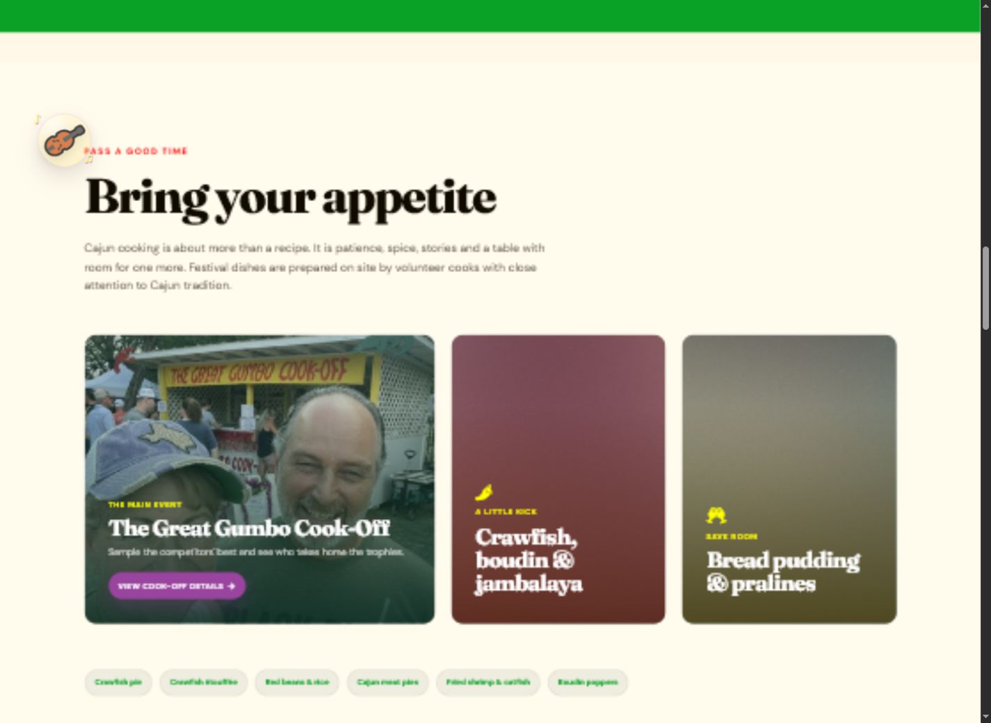
Food, music, and culture are given visual weight, which helps the site sell the day instead of only listing the schedule.
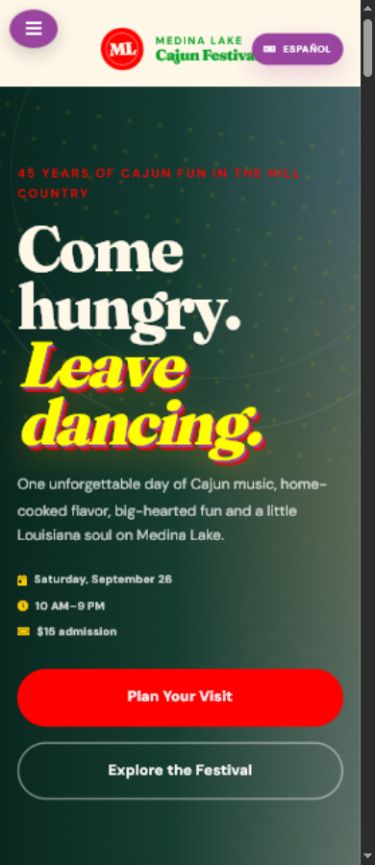
The mobile layout keeps the headline, event facts, and primary actions easy to reach for visitors planning on the move.
The job
Our client needed a site with energy, clarity, and momentum. The revamped festival site leans into a high-impact Cajun palette, oversized type, illustrated anniversary artwork, and direct planning paths so the website feels celebratory without hiding the practical details.
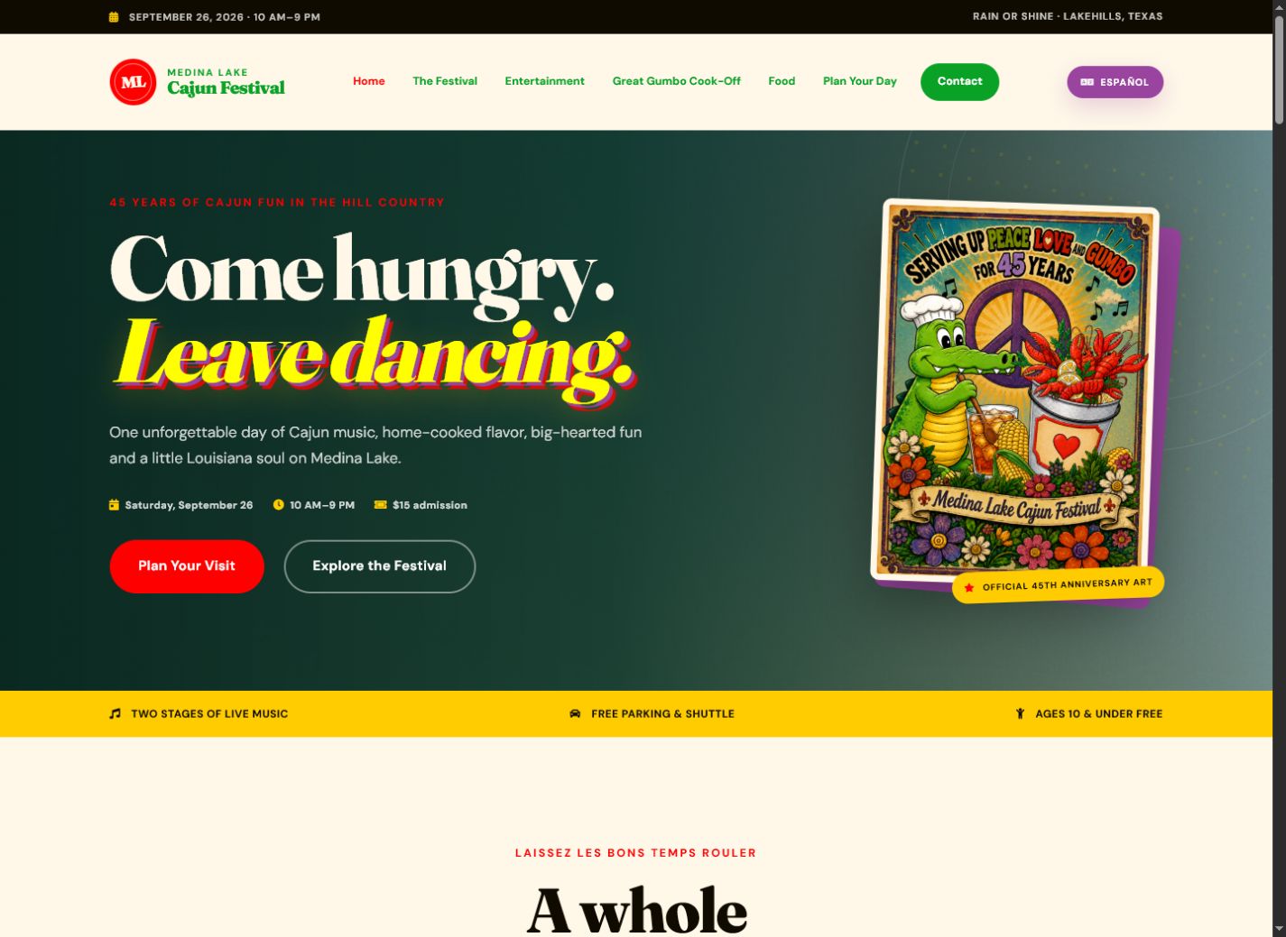
The homepage opens with "Come hungry. Leave dancing." and an illustrated anniversary poster that gives the event an instant voice.
Date, hours, admission, and planning buttons stay close to the main message so visitors can act while the excitement is fresh.
The design gives the gumbo cook-off, live music, and festival food enough personality to feel like featured attractions.
The site still works as a quick field guide when someone is checking details from the car, the line, or the festival grounds.
Design direction
A strong festival website should make people want to show up, then answer the practical questions that decide whether they actually do. This one uses movement, angled screenshots, high-contrast color, and clear calls to action to make the online experience feel as lively as the event itself.